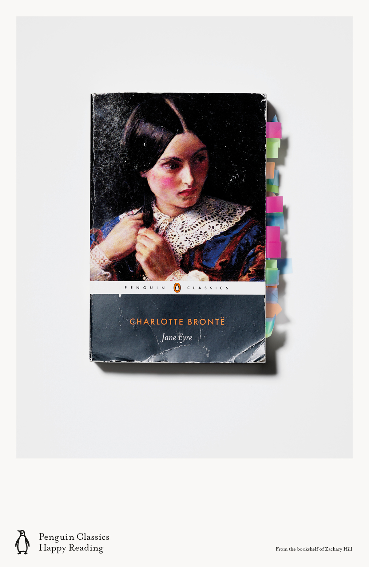
This new ad campaign for Penguin Classics is lovely. (More here.)
Official website of the author
This new ad campaign for Penguin Classics is lovely. (More here.)
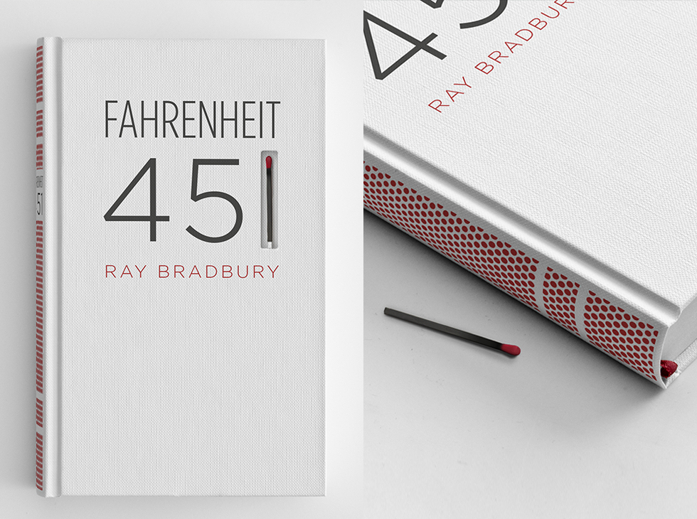
Concept design by Elizabeth Perez for Fahrenheit 451. “The book’s spine is screen-printed with a matchbook striking paper surface, so the book itself can be burned.” Very cool.
Proposed logo for Ford, designed by Paul Rand, 1966. Details here.
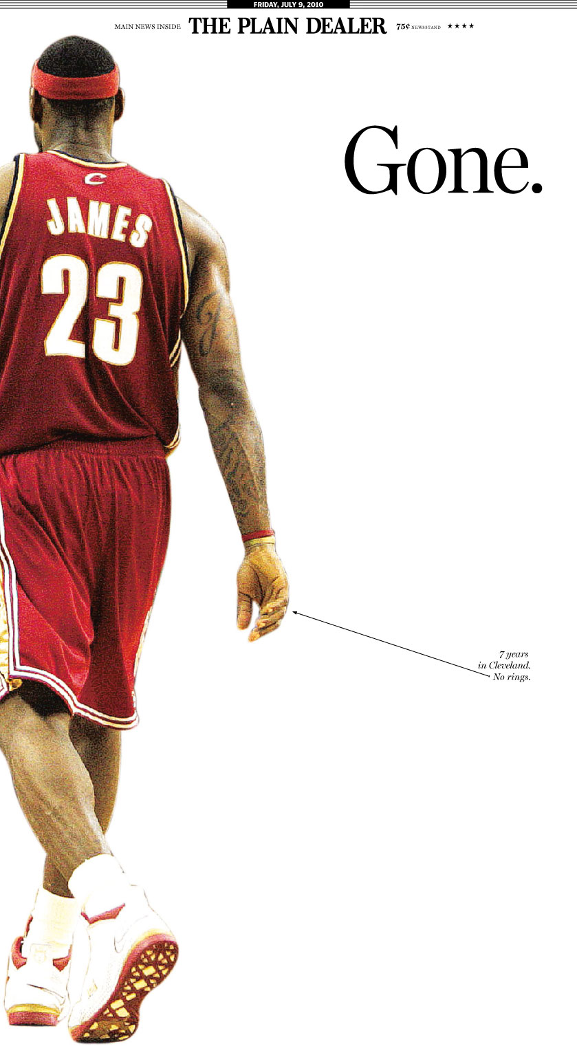
There is not much left to say about the LeBron James debacle. There is enough harrumphing already about James’s narcissism. (Good examples here, here, here or, well, anywhere you look today.)
But at least one good thing came out of it: this memorable front page of the Cleveland Plain Dealer. What a brilliant minimalist design. Great use of white space. Smart idea to position the image at the left margin to open up even more empty space in the center. The one-word, unbolded headline with a dainty little period to emphasize its brevity and completeness, set lower than an ordinary headline, in that sea of white. This is essentially a design for a poster, not a newspaper. It throws out all the usual rules for newspaper layout: no grids, no columns, minimal text. And it works beautifully. The simplicity eloquently captures what Clevelanders must have felt this morning — speechless. Here, less truly is more.
The only nitpick I have is the little arrow pointing at James’s ringless hand. (Click image to view full size.) The caption reads, “7 years in Cleveland. No rings.” Well, yes, but not exactly the whole story. LeBron is the best player on the planet at the moment, rings or no rings. But then, given Cleveland’s misery, maybe that bitter note expresses the city’s mood, too. When you get dumped, you feel hurt but also pissed off, betrayed, and sometimes you need to say stuff like this.
So bravo, Cleveland Plain Dealer! No amount of clever graphic design will save the dead-tree newspaper business in the long run, but who knows? Maybe sophisticated work like this will win readers in the brave new digital world.
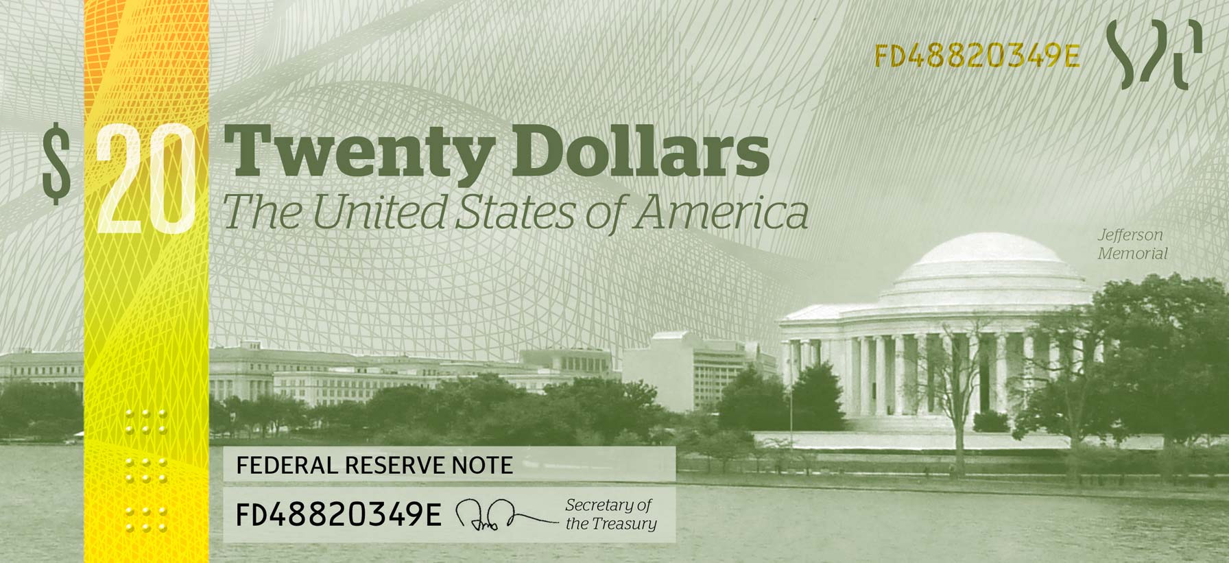
Designer Michael Tyznik’s concept for a redesign of American currency (rejected, of course).
