• Skip to main content
  • Skip to footer

William Landay

Official website of the author

  • Books
    • All That Is Mine
    • Defending Jacob
    • The Strangler
    • Mission Flats
  • News
    • Updates
    • Blog
  • Events
    • Appearances
    • Podcasts
    • Print
  • More
    • About
    • Contact

web design

Van Gogh Museum

September 22, 2014

Detail - Wheatfield With Crows

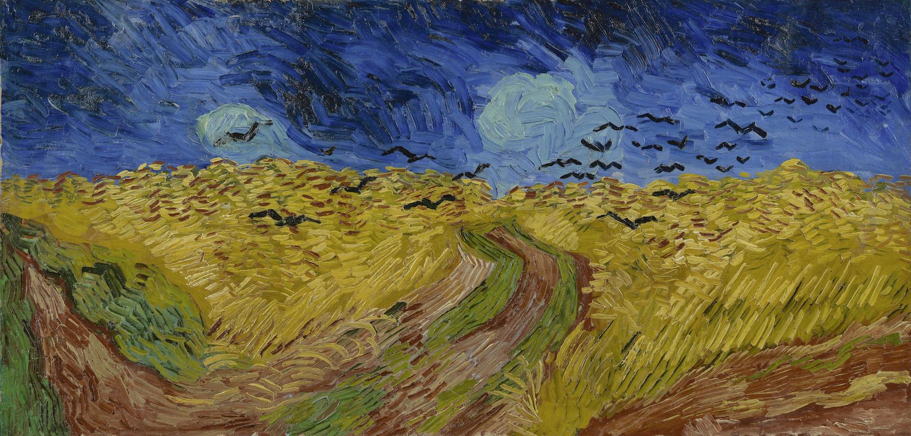
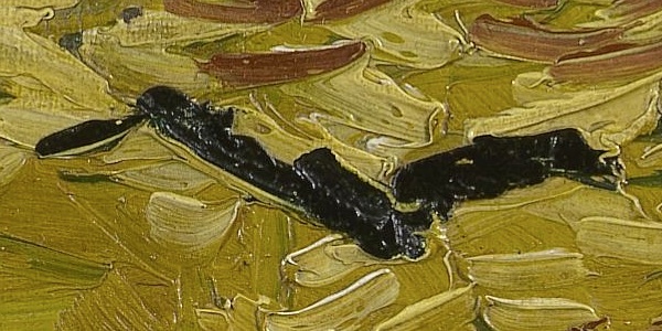
The Van Gogh Museum in Amsterdam has a beautifully designed web site with, apparently, the entire collection available in eye-popping high resolution. It is amazing what detail you can see in these high-res images, right down to the brush strokes and globs of paint. It is as if the museum guards all turned their backs and allowed you to press your nose right up to the canvas. Above is a detail from “Wheatfield With Crows” (1890), one of the last pictures Van Gogh painted before his suicide. The complete picture is below, and you can click the image to see it a little larger. But to get the full effect, go download the insanely huge image at the museum’s web site.

In May, the Met in New York posted 400,000 high-res images from its collection, so this seems to be a trend.

Van Gogh - Wheatfield With Crows (1890)

Filed Under: Art Tagged With: landscapes, museums, painting, Vincent van Gogh, web design

Creatures

April 8, 2013

Zuckerman screen shot

A beautiful web site from photographer Andrew Zuckerman with a gallery of remarkable photographs of animals. The concept: “Substituting his minimalist visual language for the conventions of traditional nature photography, Zuckerman extracted his subjects from their environments and recontextualized them in the clarifying white space to distill each animal to its most essential qualities.”

Filed Under: Photography Tagged With: Andrew Zuckerman, animals, links, nature, web design

A Little Facelift

March 28, 2013

Screen Shot 2013-03-27

Over the last few weeks this site has been updated. Nothing major — improved typography, simplified layout. But a few changes might affect visitors:

  • RSS Feed. The RSS feed has been shifted from the dying FeedBurner to this site’s own native WordPress RSS feed. If you subscribe to the blog via RSS, you will need to update that address to the new RSS feed.
  • Blog posts via email. I have removed the option of receiving blog posts via email. The trouble with having a blog-by-email service — which auto-generated an email to subscribers every time I added a post to the blog — was that it inhibited me from using the blog as I often like to: for short, occasional, unimportant posts that are more like scrapbook entries than essays. Those quick posts do not justify bothering hundreds of people with an email, which made me shy about posting anything at all to my own blog. Former blog-by-email subscribers will continue to receive the once- or twice-yearly email newsletter, and can of course subscribe to the blog via any RSS reader.
  • Comments. The moribund comment sections of the blog also have been eliminated. There just weren’t enough people commenting to justify the cost in space and clutter. Eliminating comments allowed for a cleaner, lighter design. Most visitors who wanted to comment about something just emailed me anyway, which I encourage readers to do.
  • Tumblr. I have abandoned my Tumblr blog and merged the contents back into this blog. For the last couple of years I used Tumblr as a scrapbook for things I found around the web — images, video clips, links — while the main blog was reserved for longer, essay-style blog posts. Alas, those long posts have become rare, especially in the tumult of publicizing Defending Jacob. Also, maybe I’m just old-fashioned, but I like having everything in one place, here on the main blog.

Filed Under: Internet Tagged With: web design, williamlanday.com

Apple.com today

October 6, 2011

Filed Under: Design Tagged With: Apple, minimalism, Steve Jobs, web design

FontFonter

August 7, 2010

A very neat tool: FontFonter allows you to see any web site with different fonts substituted for the defaults. Here is how this web site looks with different fonts (very handsome, if I do say so myself). And here is the New York Times refonted. Great tool for web designers, great toy for everyone else.

I recently began using Typekit for this site to allow more elegant fonts than standard browsers are capable of. (For a discussion of the technical limitations that have crippled web typography until now and how they are being overcome, look here.) The typefaces you see on this web site now are FF Tisa Web Pro for text and FF Dagny Web Pro for the smaller bits in sans serifs, with plain old Arial/Helvetica for headlines, still, because I have not been able to settle on a more interesting sans-serif that renders properly in all browsers (damn you, Internet Explorer!) and lower-resolution monitors. But I’ll keep fiddling. That’s what web sites are for, no?

Update (8.12.10): So much for the Typekit experiment. I found it was slowing down this site much too much. At times, page loads were taking over a minute, an eternity if you’re sitting in front of the computer waiting. The problem, I found — and this is true nine out of ten times that a WordPress blog slows to a crawl — is that plug-ins and calls to external RSS feeds were slowing things down, especially because WordPress requires that most of these processes be completed before the page will load at all. Typekit seemed to be one of the culprits because every page load required the download of all those pretty fonts from a remote server. So it’s back to the boring but reliable “web-safe” fonts for me. I’ll miss you, FF Tisa Web Pro. [sniff]

Filed Under: Internet Tagged With: typography, web design, williamlanday.com

A Facelift

March 12, 2010

This site has gotten a little makeover this week. Since I launched my blog last May, I have been fiddling with the design nonstop, trying to come up with something that suits me. I haven’t found the perfect fit yet, but this update moves me a little closer. Here is what I’m after.

To me, the best-looking blogs — Subtraction, AisleOne, Frank Chimero, Iain Claridge — are design blogs and they share a common philosophy: minimalist, modernist, grid-based. Those blogs were all created by respected graphic designers. You’ll see bits of all of them on this site.

A few common elements that I like:

  • The designs use mostly black text on a white background and a very few classic fonts, particularly Helvetica. Personally, I prefer a serif font for reading longer pieces, which is how I tend to write, so I’ve used Helvetica mostly for headers and sidebars. (Actually, what you are seeing here is mostly Arial, which will offend the Helvetica purists, but browsers render Arial better.)
  • My favorite designers use very little motion (Flash, Java, etc.). There are not a lot of menus dropping down, popping up, sliding out, or otherwise moving around. The designs are not all that different from a print piece. The material is organized with elegant layout and typography, not hidden behind buttons. That traditional philosophy suits a blog, which is essentially an online magazine. The screen here acts more like a printed page than a video monitor. It just … sits there. (I know: weird.)
  • The designs are flat and geometric. No glossy reflections or realistic shadows to create a trompe l’oeil three-dimensional effect. They are proudly 2D, again extending the traditional techniques of print design.

Khoi Vinh, the design director for NYTimes.com whose Subtraction is one of the most admired (and ripped off) blog designs out there, sums it up here. If you’re interested in design, click through. Otherwise, the name of his blog, “Subtraction,” says it all: if it is unnecessary frill, out it goes. Simplify, minimize, reduce.

Let me know what you think. Yes, I do all the design and coding, so changes are easy enough. And don’t be shy. My wife doesn’t like this design, so I’ve heard it all before.

Also, note that I have finally begun a mailing list. You can sign up here. I am late getting this started, of course. Like all writers, I am still learning how to be my own P.R. man. Please do join so that, when my next book comes out in spring 2011, I can reach you to let you know. Thanks.

Filed Under: Internet Tagged With: web design, williamlanday.com

Footer

  • Amazon
  • Facebook
  • Goodreads
  • Instagram
  • Threads